In a recent Gutenberg project I had situations where we needed to build many blocks that shared very similar smaller components. How often have you had to create a button that links to another page? This begs for a reusable component.
With Gutenberg it gets a little tiring because each time you have a button like this, not only do you need to make the text on the button editable but you also need to edit the link. And often times you need to change whether the button is primary or secondary. On top of all this, you need to create the view() version of this. You need to attach attributes and make sure they update correctly.
It’s a lot of work. So I started to fall into a pattern of building components that seriously cut down my development time!
Creating a reusable button with a link
Let’s begin with a blank Gutenberg block. If you need a quick environment to set up in, check out my Guty blocks 2.
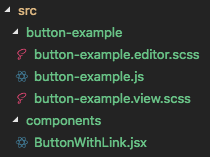
So I’m going to name my block button-example. We’re going to assume this is some block that uses the button component, but we’re not going to spend much time on the block. We’re here to make a reusable component!
So this is our initial block:
import './button-example.view.scss';
import './button-example.editor.scss';

const {
    registerBlockType,
} = wp.blocks;

const {
    InspectorControls,
    RichText
} = wp.editor;

registerBlockType('test/button-example', {
    title: 'Button Example',
    icon: 'smiley',
    category: 'common',

    supports: {
        align: true,
    },

    attributes: {
        align: true,
    },

    edit(props) {
        const { className, setAttributes } = props;
        // const {  } = props.attributes;

        return [
            <InspectorControls>
                <div style={{padding: '1em 0'}}>
                    Options
                </div>
            </InspectorControls>,
            <div className={className}>
                Button Example
            </div>,
        ];
    },

    save(props) {
        // const className = getBlockDefaultClassName('test/button-example'); // For use with say, BEM
        // const {  } = props.attributes;

        return (
            <div>
                Button Example
            </div>
        );
    },
});
If you’ve used Guty blocks 2 you’ll recognize that this is the boilerplate block. If you aren’t using my fancy boilerplate, make sure you set up a way to do styles in our block. We’re going to style things up later.
Now, we’re going to create a folder components in the src folder, and add a ButtonWithLink.jsx file inside.
Let us create a React function component that we’ll immediately export and use in our block…
import React from 'react';

const ButtonWithLink = (props) => {
    return (
        <div>
            <a href="#" class="btn btn--primary">
                This will eventually be a button!
            </a>
        </div>
    )
}

export default ButtonWithLink;
Great, now we have a link. Let’s style it:
// button-example.view.scss

.wp-block-test-button-example .btn {
    display: inline-block;
    padding: .5em 2em;
    background: #444;
    color: #fff;
    border: 2px solid #444;
    border-radius: 4px;
    transition: color 300ms, background 300ms;
    text-decoration: none;
}

.wp-block-test-button-example .btn:hover,
.wp-block-test-button-example .btn:active,
.wp-block-test-button-example .btn:focus {
    color: #444;
    background: #fff;
}
Alrighty. Now we have a button that we can use in blocks that we make by importing it in our block and calling it!
// button-example.js
...

import ButtonWithLink from '../components/ButtonWithLink.jsx';

edit(props) {
    const { className, setAttributes } = props;
    // const {  } = props.attributes;

    return [
        <InspectorControls>
            <div style={{padding: '1em 0'}}>
                Options
            </div>
        </InspectorControls>,
        <div className={className}>
            <ButtonWithLink />
        </div>,
    ];
},

...
Setting up attributes and update functions
So we need a common way for this ButtonWithLink to update the attributes of its parent. We also need to pass it attributes and populate values.
So lets start by creating our attributes in button-example.js:
attributes: {
    buttonText: {
        type: String,
    },
    buttonUrl: {
        url: string
    }
},
Now, we need to think about how we’re going to keep our updating functions general enough so that we could reuse this component in any block.
Here’s a way to do it: we will have a generic update function that takes a key and a value from the button component and update attributes. Also, I’m going to pass the button components the attributes while we’re here…
edit(props) {
    const { className, setAttributes } = props;
    const { buttonText, buttonUrl } = props.attributes;

    function updateAttr(key, value) {
        setAttributes({
            [key]: value,
        });
    }

    return [
        <InspectorControls>
            <div style={{padding: '1em 0'}}>
                Options
            </div>
        </InspectorControls>,
        <div className={className}>
            <ButtonWithLink
                url={buttonUrl}
                text={buttonText}
            />
        </div>,
    ];
},
Okay, so how do we now update those attributes?
The tricky part is that there might be more than one button in a block, and each button is going to need to update different things in the attributes.
So, I’m going to say that this component should have an onButtonTextChange and an onUrlChange. When those are called, I will then instruct my block where to place the values I’m getting from these change functions. First, this is what my ButtonWithLink Should look like:
// ButonWithLink.jsx

import React from 'react';

const {
    RichText,
    URLInputButton
} = wp.editor;

const ButtonWithLink = (props) => {
    return (
        <div>
            <RichText
                className="btn btn--primary"
                value={props.text}
                placeholder="Place your button text here!"
                onChange={props.onButtonTextChange}
            />
            <URLInputButton
                url={props.url}
                onChange={props.onURLChange}
            />
        </div>
    )
}

export default ButtonWithLink;
Next, we set up our component in our block:
...
<ButtonWithLink
    text={buttonText}
    url={buttonUrl}
    onButtonTextChange={val => updateAttribute('buttonText', val)}
    onURLChange={val => updateAttribute('buttonUrl', val)}
/>
...
This way we can tell which attribute to update in the block, and we don’t have to hard-code the ‘buttonText’ and ‘buttonUrl’ into the component.
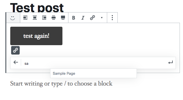
By the way, if you load this in the editor, you’ll see why URLInput is so awesome. It auto-suggests posts and pages. Super nice!
Making a View for this Reusable Component
Alright, so we have a Button component working. We have a way to edit text and set up a corresponding url. Now we need to make a way to save this in our save().
I stole the following idea from RichText. Gutenberg already has a corresponding RichText component for views. You simply use RichText.Content.
How? We do the following in ButtonWithLink.
ButtonWithLink.View = (props) => {
    return (
        <div>
            <RichText.Content
                className="btn btn--primary"
                value={props.text}
                tagName="a"
                href={props.url}
            />
        </div>
    )
}
What are we doing here? Well, in Javascript functions are objects. So we are saving another function onto the ButtonWithLink function/object. We can access it now as <ButtonWithLink.View />. It’s a nice way to encapsulate our button into one import.
Now we make sure to change our save function in our block.
save(props) {
    // const className = getBlockDefaultClassName('test/button-example'); // For use with say, BEM
    const { buttonText, buttonUrl } = props.attributes;

    return (
        <div>
            <ButtonWithLink.View
                text={buttonText}
                url={buttonUrl}
            />
        </div>
    );
},
Let me know what you think!
I think in the near future I’ll do another example of this with images and clickable/editable images in the editor.
For now, let me know what you think! Hit me up @jschof or in the comments below.
it’s a very interesting article. But a problem remains, how do we do for PHP views?
There are ways to have PHP call the javascript and render out the block while PHP is building the view. You don’t even need to have edited the block in the editor to generate the markup- it’s all done in PHP. They’re called “dynamic blocks“. The only problem is that you still need to create the block in JS.
This is the overall move in WordPress, though. You can still do a lot through just PHP, but JS is going to control the view more and more.
Yes, I did it in php, in fact it’s relatively simple also in php … however, regarding views in php, sometimes we have to use them. the example that comes up often is that of the last 3 articles. The javascript views save the last articles when saving the block, so when you write a new post, it is not visible
I congratulate you for your tutorials, I am a web developer without much experience and I learned a lot of things about gutenberg thanks to your tutorials
Just want to say thanks, this was really helpful for me. I’m still getting my head around React, and while I actually am not reusing components yet, your code examples helped me piece some things together. Much appreciated!