Recently a colleague was wondering if there was a way to share functionality between Gutenberg Blocks. What if you need to have blocks wrapped by common structural elements like constraints, vertical rhythms, or colored backgrounds? What if you wanted certain blocks to all “animate in” when they come in the viewport?
What if you want to be able to select the background color each time? You don’t want to wire in a “backgroundColor” attribute to every block you have to do this with. Same with padding: you don’t want to create fields for each side of padding, create the functions to change those, and redo the inspector controls every time.
I tried two concepts to be able to share functionality:
- Using render props (a time-honored React tradition)
- Using what I’ll call a “higher order block” (also in the tradition of React stuff)
I won’t work through my entire thought process creating these here, but I will annotate my code… I have all this code on a proof of concept branch in my Guty Blocks 2 repo.
➡ Important note – This is only intended for developers to compose functionality between blocks. If we want to talk about site builder blocks, or blocks that let content creators share things between blocks, this is not what I’m talking about 🙂
Using render props to share functionality
Again, render props are a common pattern in the React world. The nice thing is that you’re able to call in these components and basically wrap only what you want to wrap. You don’t have to do any deep nesting of functions or views. You don’t have to pass props through and make sure you pass everything through.
// file: 'src/mixins/BackgroundRenderProp.jsx'
import React from 'react';

const { InspectorControls } = wp.editor;
const { ColorPicker } = wp.components;

// We can use a stateless functional component
// because all the state is stored and handled
// inside the block attributes!
const BackgroundRenderProp = (props) => {

    /*
    * This weirdness comes from the fact that the ColorPicker component
    * gives you an object with many representations of colors.  I pull
    * off the rgb object and return it as a string for simplicity
    */
    function changeToRGBA({ rgb }) {
        return `rgba(${rgb.r},${rgb.g},${rgb.b},${rgb.a})`;
    }

    return ([
        // even though these Inspector controls are nested, they show up in the
        // sidebar just fine
        <InspectorControls>
            <ColorPicker
                onChangeComplete={(value) => props.handleColorChange(changeToRGBA(value))}
                />
        </InspectorControls>,
        <div class="backgroundWrapper" style={{background: props.backgroundColor}}>
            {/* Here is where the render props magic happens.  We pass in a function
            that will render out what we want here.  It's very similar to props.children.*/}
            {props.render()}
        </div>
    ])
}

export default BackgroundRenderProp;
And this is how we use the component inside some block:
import './render-props-background.view.scss';
import './render-props-background.editor.scss';

const { registerBlockType } = wp.blocks;
const { InspectorControls } = wp.editor;

// Pull in our render props component!!
import BackgroundRenderProps from '../mixins/BackgroundRenderProp/BackgroundRenderProp.jsx';

registerBlockType('guty-blocks-2/render-props-background', {
    title: 'Some other block!',
    icon: 'smiley',
    category: 'common',

    // We do have to make a background color attribute to save our selection
    // This is the downside of render props- this block needs to set up
    // this attribute
    attributes: {
        backgroundColor: {
            type: 'string',
            default: null,
        }
    },

    edit(props) {
        const { className, setAttributes } = props;
        const { backgroundColor } = props.attributes;

        // I like pulling out the update functions to keep things tidy
        function changeBackgroundColor(value) {
            setAttributes({ backgroundColor: value });
        }

        return [
            <InspectorControls>
                {/* I include some options here to show that the options from the render props component
                get combined with any options from the block itself */}
                <div style={{ padding: '1em 0' }} >
                    Options
                </div>
            </InspectorControls>,
            // This component expects the current background Color, a function to handle colors changing,
            // and the render part is what should be wrapped
            <BackgroundRenderProps
                backgroundColor={backgroundColor}
                handleColorChange={(value) => changeBackgroundColor(value)}
                render={() => {
                    return (
                        <div className={className}>
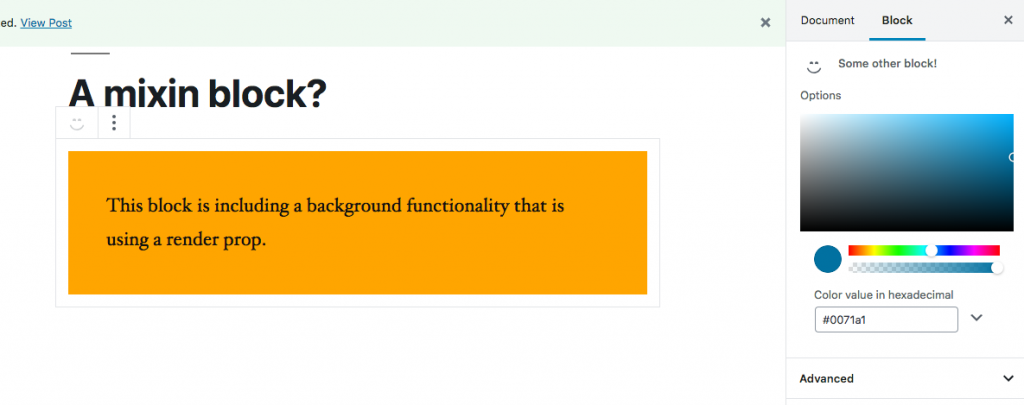
                            This block is including a background functionality that is using a render prop.
                        </div>
                    );
            }} />
        ];
    },

    save(props) {
        const { backgroundColor } = props.attributes;

        return (
            // The nice thing is that we basically can include everything from the edit method
            // and not include any interactive functions
            <BackgroundRenderProps
                backgroundColor={backgroundColor}
                render={() => {
                    return (
                        <div>
                            This block is including a background functionality that is using a render prop.
                        </div>
                    );
            }} />
        );
    },
});
And voila- we have a component that is wrapped by this background color changer functionality!

Notice that “options” on the sidebar is from our parent block while the actual color-picker is from the render props component.
Downsides:
- You still have to create a background color attribute at the block level and manage the color change instructions for each block you use this render prop with.
- It’s ugly. This is my preference, but passing JSX elements inside an arrow function stored in a prop of a component is… well… ugly. It also clutters the code inside the edit and save methods.
Upsides:
- You can control how the block handles color changes each time if you need to. This is the main reason render props exist- to share functionality but with less magic.
- At the end of the day, this is all usual React patterns. Someone seeing this would not be surprised, and many things inside of the components for WordPress use this render props pattern (like media block).
“Higher Order” Gutenberg Block
The strategy here is not to create a higher order React component. But we are doing a “higher order” thing here because we’ll take a block, put it in a function, and that function will return a copy of that block with the built in functionality added to it. I call it “Background Wrapper Block.”
import react from 'react';

// In guty blocks 2 if I import a *.view.css file it will
// simply be included, so I can include commonly used css here!
import './BackgroundWrapper.view.scss';

// We won't assume that blocks have these things, so we need to make sure
// to import them from WordPress.  This is also something
// that could happen in the render props implementation
const { InspectorControls } = wp.editor;
const { ColorPicker } = wp.components;

/**
 * Here is the magic.  This is simply a function.  It's taking a block config object
 * (The second argument of 'registerBlockType'), keeping some things, and adding
 * other things to it.  It returns an extended block config object.
 */
const BackgroundWrapper = (blockConfig) => {
     const wrappedConfig = {
         // Keep things from the original!
        title: blockConfig.title,
        icon: blockConfig.icon,
        category: blockConfig.category,

        // We merge in the attributes we need so we don't
        // have to define them in the original block!
        attributes: {
            backgroundColor: {
                type: 'string'
            },
            ...blockConfig.attributes
        },

        // Here we create an edit function that runs ANOTHER edit
        // function from the original block!
        edit(props) {
            const { setAttributes } = props;
            const { backgroundColor } = props.attributes;

            function changeBackgroundColor({rgb}) {
                setAttributes({ backgroundColor: `rgba(${rgb.r},${rgb.g},${rgb.b},${rgb.a}` });
            }

            return ([
                <InspectorControls>
                    <ColorPicker
                        color={backgroundColor}
                        onChangeComplete={(value) => changeBackgroundColor(value)}
                        />
                </InspectorControls>,
                <div className="backgroundWrapper" style={{ background: backgroundColor}}>
                    {/* Since 'edit' is just a function, we make sure to run the original block
                    function here so the original block rendering shows up! */}
                    {blockConfig.edit(props)}
                </div>
                ]
            );
        },

        // Same thing here.  We run a save function that runs the original block
        // save function inside it!
        save(props) {

            const { backgroundColor } = props.attributes;

            return (
                <div className="backgroundWrapper" style={{ background: backgroundColor}}>
                    {blockConfig.save(props)}
                </div>
            );
        }
    }

    // Important!  We need to pass on the modified block config object!
    return wrappedConfig;
}

export default BackgroundWrapper;
And we have to change how we do our blocks just a teensy bit:
import './background-wrapper-block.view.scss';
import './background-wrapper-block.editor.scss';

import BackgroundWrapper from '../mixins/BackgroundWrapper/BackgroundWrapper.jsx';

const {
    registerBlockType,
    getBlockDefaultClassName
} = wp.blocks;

const { InspectorControls } = wp.editor;

// Everything is normal up to HERE.
// instead of making an object literal, we define
// the object as "config". Later on we pas this object
// through our "backgroundWrapper" function before
// we register it
const config = {
    // Normal block stuff in here!
    title: 'Background Wrapper Block',
    icon: 'format-aside',
    category: 'common',

    attributes: {  },

    edit(props) {
        const { className, setAttributes } = props;

        return [
            <InspectorControls>
                <div style={{padding: '1em 0'}}>
                    Options
                </div>
            </InspectorControls>,
            <div className={className}>
                This block is using a "Higher Order Block" to include a background color change functionality.
            </div>
        ];
    },

    save(props) {
        return (
            <div>
                This block is using a "Higher Order Block" to include a background color change functionality.
            </div>
        );
    },
};

// Notice we wrap the object with the function before we register it!
registerBlockType('guty-blocks-2/background-wrapper-block', BackgroundWrapper(config));
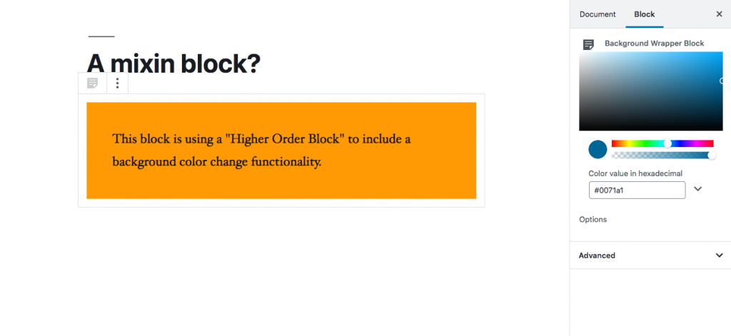
And here we are!

Notice that this block’s wrapped config is above the blocks default options in the sidebar. This can be reorganized by simply switching the items in the edit method of the wrapper function.
Downsides
- This is much more magical than before. We only really change our original block by including the wrapper function right before registering a block. Some people may be confused about where this stuff is coming from
- We blend in attributes that we’re assuming don’t exist on that block already. We probably should call it something more specific like “wrapperBackgroundColor” to make sure there are no naming conflicts
- If you’re adding many different wrapper functionalities this could quickly spiral into higher order component hell. I would suggest that there be a few critical layout wrappers that you use- maybe vertical spacing, section backgrounds, and sections widths. If you start nesting these HOBs more than two or three… you may want to reevaluate in my opinion.
Updsides
- I think it’s so so so much cleaner in the original block. To include it you wrap the block object and you’re done. All the important stuff is taken care of.
- The implementation is a constraint point for your blocks. If something is a very common pattern in your blocks, you don’t want to have to rewrite that pattern in each block if it changes. Sure, render props are kind of like that, but you do need to modify how they’re set up inside of the original block if anything changes. With this, everything is housed in the wrapper.
Conclusion
As you can probably tell, making a wrapper function, a “Higher Order Block,” is my favesies. I think it’s so much more portable, more clean, and easier to modify. But doing render props is not out of the question, and sometimes you need the block creators to have a hand in the added functionality themselves.
Let me know what you think! Add a comment below or hit me up on twitter @jschof!