HTML5 offers a lot of built-in form validation functionality. In my last project, I decided I didn’t want to reinvent the wheel when it comes to forms, and I didn’t want to install another Vue dependency to do some simple form validation.
This is intended to help those that want to leverage the native HTML5 attributes and form functionality. I will be covering in the context of Vue.js, but the same thing can be done in vanilla js or any other framework.
I will cover:
- How to style inputs based on
:validandinvalidpseudo-class - How to set up a form to handle error checking
- How to catch error messages and display them to the user
- How to handle revisions to the form information
What are :valid and :invalid?
HTML5 has some really nice things built in for us. The pseudo classes :valid and :invalid are placed on elements when the elements are checked on form submission.
So instead of us manually checking form elements and adding/subtracting classes to show error states, we can let our browser do it natively. So we can do styles based on :invalid and :valid, something like…
input:invalid {
    border-color: red;
}
input:valid {
    border-color: green;
}
Instead of writing a whole bunch of logic to check validity, let’s use HTML5 attributes then, because we then can leverage native validity checking.
For example, below is an text input that is required.
<input type="text" required />If the user tries to submit the form without this requried field the native form error checking will kick in and will not submit the form.
What’s really nice is that you can use regex to test password strength:
<input type="password" pattern="^(?=.*[A-Za-z])(?=.*\d)[A-Za-z\d]{8,}$" />In the case above, the input will check to make sure that the password has a Capital letter, is at least 8 characters long, and has one special character. If not, our form will properly update the pseudo-classes for us!
➡️ One caveat here: There are some things that just aren’t supported natively, like creating a confirm password input that has to match the original password. You will need to create some sort of check with javascript for that. ?
How to set up the form to use native form validation
We do need to hook into the form functionality in order to leverage native form validation. So first, we need to turn of form validation. That’s right, turn it off… I’ll explain. I’m going to be doing this example using Vue.js, but again, you can do this using vanilla js or any other framework if you pay attention to the fundamental events and html5 api.
<form novalidate @submit.prevent="handleSubmit">
     ...
</form>
We’re going to be triggering validation manually. Without JS I believe the flow goes like this:
(User clicks submit) → (form checks validity) → (if valid, form will submit and trigger submit event)
The problem I ran into is that without novalidate, the submit event will not be triggered if something isn’t valid.
So short story, turn off validation, and we will trigger validation in our handleSubmit method when we need it.
By the way, the @submit.prevent=... is a custom Vue bind that automagically will prevent the form from submitting in the default manner. If you use vanilla js, just make sure you use event.preventDefault() in your handler.
So for Vue, we’ll do this…
data() {
  return {
    username: '',
    password: '',
    formChecked: false,
  };
},
methods: {
  handleSubmit(event) {
    this.formChecked = true;
    if (event.target.checkValidity()) {
      // Submit!  Everything is okay!
    }
  },
}
We use the formChecked data to turn on a formChecked class on the form. Without a formChecked type of flag class, :valid and :invalid classes would always show. We only want to show these styles after the form is validated. So we namespace our pseudo-classes this way:
.was-validated input {
  &:valid {
    border-color: green;
  }

  &:invalid {
    border-color: red;
  }
}
So here is a complete pen that will handle error states and style inputs when the form has an error:
See the Pen Leveraging Form Validation in Vue.js by Jim Schofield (@oldcoyote) on CodePen.
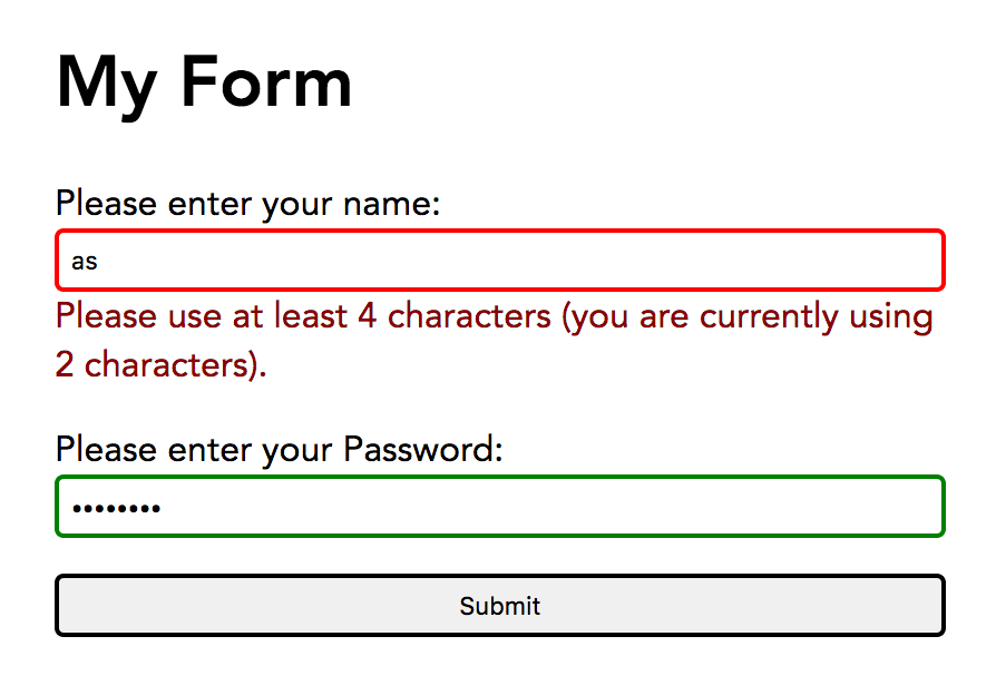
Handling native error messages
Part of the reason I wanted to use native form validation is so I wouldn’t have to make my own error messages for every thing that could go wrong in validation. Wouldn’t it be nice if we could capture the error that the browser would use?
There’s a handy event called the invalid event. This event fires whenever an element in a form is declared invalid. We’re going to add a listener to each of our input elements that captures the error message, and displays it if there is an error. Here’s what that would look like:
<template>
<!-- other stuff removed for simplicity -->
<input type="text" @invalid="handleInvalid" />\
<div v-if="errorMessage">
{{ errorMessage }}
</div>
</template>

<script>
export default class {
  data() {
    return {
      errorMessage: '',
    }
  },
  methods: {
    handleInvalid(event) {
      this
    },
  },
}
</script>
Here is an example that functions from Codepen
See the Pen Leveraging Form Validation (with error message) in Vue.js by Jim Schofield (@oldcoyote) on CodePen.
Notice that above I simple pass the browser error right to the user error area. For the password, however, often the native error is not very good. So I hard code my own message in the password area.
Also notice that we’re creating a handler for every input… this is not ideal. If you check out my other post about creating form elemements in vue, you might try adding this error handling inside of components. That way you can reuse this functionality without duplicating code.
Handling user revisions
One thing you’ll notice above is that if you revise your input and it is now green because it’s valid, the error message doesn’t disappear.
There are many ways to do this. One way is to re-validate the form when both are true:
- The form has been checked in the past
- A new character was entered
Here is a final version where the form updates after the user revises their invalid input.
See the Pen Leveraging Form Validation (with error message, and handling user revision) in Vue.js by Jim Schofield (@oldcoyote) on CodePen.
Note again that I’m duplicating code. You can try to make these for elements a component that handles it’s own re-checking, and then you wouldn’t need a recheckUserElement and recheckPasswordElement.
Conclusion
Hopefully you have a good idea of how to incorporate native form validation functionality like the invalid event in Javascript and the :valid / :invalid pseudo-classes in CSS.
Above is a simplified version, but there are ways to build on this to make components truly re-usable. Check out my other post on creating transparent wrappers for form elements in Vue.js.
Hi. Really nice guide, i would really love if i could see your codepen fiddles. There seems to be a sameorigin issue, so they are not showing 🙁
Thanks for sending me a message. I’m checking a couple different browsers and it seems to be working for me? The codepen embeds are definitely throwing some errors and weirdness though… What browser/system are you using?