This is the second part of an article in a series on creating WordPress Gutenberg blocks. Here is part 1. If you want to pick up where we are, here is the repository.
A lot has changed since this article was published a year ago. It’s really hard to keep your writing updated. I think I’ve for the most part succeeded this past year and these articles will be helpful to you. But I want to warn you that there may be updates in dependencies or Gutenberg itself that might need some care if you’re following my examples. I try to write updates as I learn about changes, so also take a look at my most recent posts.
We left off last time with a Gutenberg hero image block that had centered text over an image. We added the ability to edit that text and change the text color. It started to get a little long, so the homework I left off with was to set up the overlay so that it would also be able to be changed with a color palette option in InspectorControls. We still have yet to use the wonderful MediaUpload component.
The repo for this in all its finished glory is here if you would desire it.
Let’s do this.
How I hooked up the ColorPalette to our transparent overlay
There are many ways to skin a cat. Here is the route I chose: I will apply an opacity to our to our overlay through the css, but since the color of the background will be determined by the content editor I’ll apply that color inline.
.wp-block-firstgutyblocks-hero-image .overlay {
    position: absolute;
    top: 0;
    left: 0;
    width: 100%;
    height: 100%;
    /* background: rgba(150,0,0,.3); <- old*/
    opacity: .3;
}
In our index.js, I will be adding an overlayColor attribute and add that as an inline style on my overlay div:
...
attributes: {
    textString: {
        type: 'array',
        source: 'children',
        selector: 'h2',
    },
    fontColor: {
        type: 'string',
        default: 'black'
    },
    overlayColor: { // new!
        type: 'string',
        default: 'orange'
    }
},

...

edit(props) {

    const {
        setAttributes,
        attributes,
        className,
        focus
    } = props;
    const { fontColor, overlayColor } = props.attributes;

...
<div
    className={className}
    style={{
        backgroundImage: `url('http://placehold.it/1440x700')`,
        backgroundSize: 'cover',
        backgroundPosition: 'center'
    }}>
    <div
        className="overlay"
        style={{ background: overlayColor }} {/*NEW!*/}
        ></div>
    <RichText
        tagName="h2"
        className="content"
        value={attributes.textString}
        onChange={onTextChange}
        placeholder="Enter your text here!"
        style={{color: fontColor}}
        />
</div>
Orange is a temporary choice just to make sure it’s working. And tada! Here we have it if we reload the editor!
Okay, so now let’s add another ColorPalette component in the InspectorControls and hook it up so the user could change the color:
...
// Adding an attribute handler
function onOverlayColorChange(changes) {
    setAttributes({
        overlayColor: changes
    })
}

...

//Adding another control to the InspectorControls
<InspectorControls>
    <div>
        <strong>Select a font color:</strong>
        <ColorPalette
            value={fontColor}
            onChange={onTextColorChange}
            />
    </div>
    <div>
        <strong>Select an overlay color:</strong>
        <ColorPalette
            value={overlayColor}
            onChange={onOverlayColorChange}
            />
    </div>
</InspectorControls>,
An we now can edit text, edit the text color, AND change the overlay color.
Uploading a background image using MediaUpload
It’s super nice that the gutenberg editor gives us a bunch of components through wp.block that we can use. Another component that is super nice is MediaUpload that does a lot of work for us.
MediaUpload is a component that uses what’s called render props. You don’t have to go into detail about what those are, just realize they’re a thing and they’re very similar to Higher Order Components. (And If you want to see a really great talk about why these things exist and how React has evolved with these sorts of things, here’s a really great talk on it.)
ANYWAY! Let’s pull in the Media Upload, and create a new attribute that will hold our picture’s url.
const {
    registerBlockType,
} = wp.blocks;

{
    RichText,
    InspectorControls,
    ColorPalette,
    MediaUpload  // Thanks wp.editor!
} = wp.editor;

...

attributes: {
    textString: {
        type: 'array',
        source: 'children',
        selector: 'h2',
    },
    fontColor: {
        type: 'string',
        default: 'black'
    },
    overlayColor: {
        type: 'string',
        default: null // let's get rid of the annoying orange
    },
    backgroundImage: {
        type: 'string',
        default: null, // no image by default!
    }
},
Now, let’s place our MediaUpload component:
<InspectorControls>
    <div>
        <strong>Select a font color:</strong>
        <ColorPalette
            value={fontColor}
            onChange={onTextColorChange}
        />
    </div>
    <div>
        <strong>Select an overlay color:</strong>
        <ColorPalette
            value={overlayColor}
            onChange={onOverlayColorChange}
        />
    </div>
    <div>
        <strong>Select a background image:</strong>
        <MediaUpload
            onSelect={(imageObject) => console.log(imageObject)}
            type="image"
            value={backgroundImage} // make sure you destructured backgroundImage from props.attributes!
            render={({ open }) => (
                <button onClick={open}>
                    Upload Image!
                </button>
            )}
        />
    </div>
</InspectorControls>,
A few things to note here:
- The “onSelect” attribute is where we will eventually handle the new picture and save it’s url to “backgroundImage”. For now, we will console.log this thing to see what MediaUpload gives us after we select an image
- The most confusing part is the render attribute. Basically whatever is returned inside the parentheses (in this case the <button> markup) will be shown in the editor. MediaUpload doesn’t add anything more, but it does let you have that “open” function. Whatever element is bound to that with onClick will be hooked up to open the MediaUpload library.
So if all goes well you can load the block, click the button, upload and select and image, and then check the console…
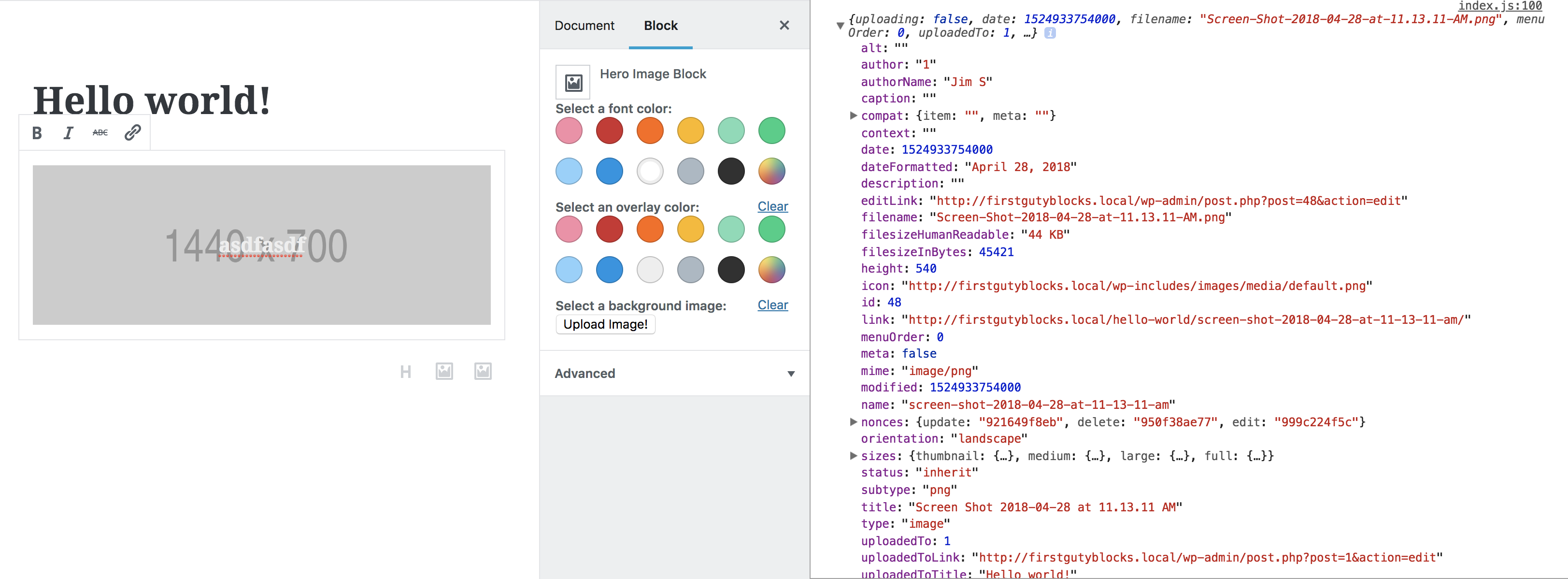
MediaUpload wraps our button and allows us to make a button that opens up our media library. Once we select an image, MediaUpload returns that image object. For now, we set that to simply console.log the object.
MediaUpload and the object it returns
If you look closely, you notice that there’s a “sizes” property on this object? inside of that we have lots of things that are served up by WordPress…
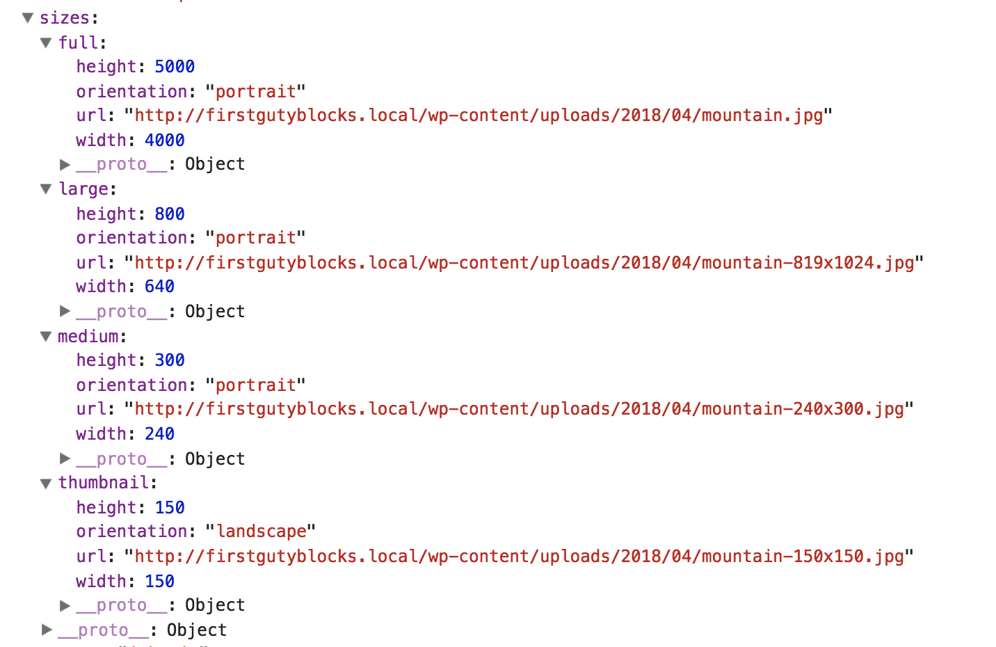
WordPress does it’s thing and resizes your image with different dimensions it would ordinarily use with srcset. In this case, my picture was very large so I get a full, large, medium, and thumbnail. In our case, I’m going to use “full” since these images are supposed to be large, detailed, full resolution things. There’s room for optimizing and file size later!
So here’s the point, we need to create a function that will handle this object and setAttributes:
function onImageSelect(imageObject) {
setAttributes({
backgroundImage: imageObject.sizes.full.url
})
}
...
<div>
<strong>Select a background image:</strong>
<MediaUpload
onSelect={onImageSelect}
type="image"
value={backgroundImage}
render={({ open }) => (
<button onClick={open}>
Upload Image!
</button>
)}
/>
</div>
...
//We need to make sure our div styles use this image!
<div
className={className}
style={{
backgroundImage: `url(${backgroundImage})`,
backgroundSize: 'cover',
backgroundPosition: 'center'
}}
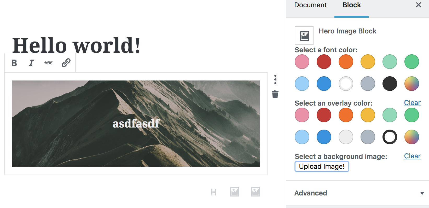
>Now, instead of logging the image when you select it, onImageSelect will set the attribute with the url of our image. You should see the image automatically change when you select it.
Edit: One thing I forgot to mention
I forgot to make this explicit when I first posted this. We need to make sure that this background image shows up when we hit update! Here is what my save() method looks like now.
save(props) {

    const { attributes, className } = props;
    const { fontColor, backgroundImage } = props.attributes;

    return (
        <div
            className={className}
            style={{
                backgroundImage: `url(${backgroundImage})`,
                backgroundSize: 'cover',
                backgroundPosition: 'center'
            }}>
            <div className="overlay"></div>
            <h2 class="content" style={{ color: fontColor }}>{attributes.textString}</h2>
        </div>
    );
}
Summary
That was a a lot, but I hope that through this process this gives you ideas how to wire up your own custom block. In these past two posts we
- Structured the markup of a block to create an image hero
- Learned how to use InspectorControl, ColorPalette, and MediaUpload
- Used both css and inline styles
Thoughts? Comments? Please post below or hit me up on twitter: @jschof
Thanks for sharing! Love seeing what people are building with Gutenberg.
For most basic fields, i suggest also checking out Gutenberg Fields middleware by the folks at rtcamp. https://github.com/rtCamp/gutenberg-fields-middleware
Hey, thanks for sharing that, that is super handy. I’m going to give it a whirl.
It seems to no longer work with Gutenberg 2.8.0 🙁
Thanks for catching that. I noticed that InspectorControls weren’t showing anymore. The fix was to remove “focus &&”. The good news is that we don’t need to manage the focus anymore. Was that what you saw?
Wow, great tutorial… ‘cept I can’t get it to work lol
I’ve realised though my server doesn’t have `npm` installed, and nor will it. Is that a show stopper? Is that required for the end product?
I’ve just tried it in an install (with Gutenberg 3.5.0, WordPress 4.9.8) and the option of “Hero Image Block” comes up, but if you click it, the inner boundary of the admin area turns white and the page hangs.
Yeah, so it’s been a while since I’ve worked on this and I think something went wrong with my repo. I’m in the process of going back and troubleshooting what’s changed. That’s Gutenberg though, things change fast!
I was getting an error with the image button so I added the Button Component ‘const { RangeControl, Button } = wp.components;’ and it worked.
Great tutorial by the way!
Thank you so very much for shedding some light on build-in controls. I hope when gutenberg is shipped, they will document different props and usages of the controls, until then, you really saved my life?.
Hi there,
I am literally lifting the code, and its coming up with an unexpected token when using <div for example.
Any ideas. Can you share the full code all together ?
Shoot. I know another had the same issue. I think babel is not working for some reason. (Do you have a .babelrc file?) You can check my GitHub repo and compare, or just clone it and see if you run into the same issue. In a week or so I’m going to be doing a new post with (hopefully) and easier setup!
Nice article, but I am looking for a way to load multiple images.
Make a Gutenberg block image gallery.
Thanks,
Perrrrrfect!
I merged this code with “Editor Block” plugin core.
The Custom Hero obtained is beautiful.
♥
I’m new to JSX. Having variable substitution problems. `url(${backgroundImage})` syntax doesn’t return the attribute value – simply everything in the single quotes comes back as a string. PHP those singles would need to be doubles – tried that and it didn’t work. Any suggestions? Found this on Stack…https://stackoverflow.com/questions/32457610/set-background-image-through-function-or-variable
Can you share your code? I guess I’d have to see it in its context.
Sorry to bug you again. I’ve identified that it is a character encoding issue which I really dont know how to address. the ‘tick mark’ is not a single quote. When I copy and paste your code – it works. If I use the tick mark ` from my keyboard (under the ~ ) it breaks the whole block. As a self-taught programmer, I hope you can sympathize with me and lend a hand.
Work around — to the tick mark for those having the same issue…
function onImageSelect(imageObject) {
let style = ‘url(‘ + imageObject.sizes.full.url + ‘)’;
setAttributes({
backgroundImage: style
})
}
Right on with the self-taught part. Fight the good fight!
Wow, that is really strange. I’ve heard of encoding issues with directional single quotes but not with back ticks!
My thought here is you could also do:
style={{ backgroundImage: “url(‘” + imageObject.sizes.full.url + “‘)”}}
(and for clarity, I’m using ” to denote javascript strings, and in those strings, I’m using single quotes ‘ to actually be output)
The code in the GitHub repo no longer works – due to an #130 error in the editor when adding the block to a post. Probably things have changed in a year.
These articles were super useful. I looked at many Gutenberg articles but none of them was clear as this one.
With the help of these articles I have created my own block on my local word press server, but I cannot find any article on how to move that block to the live wordpress server.
How can I move (what files I need to copy and where or) what steps I need to take to move my Gutenberg block from local wordpress server to live wordpress server? Please help.
You need to move the plugin folder in your local set up to the plugin folder on your live site server. There are a few ways to do this.
1) Probably the easiest way is to use FTP to move the guty blocks folder to from the plugins on your local to your live site.
2) I believe you can “zip” your plugin folder up, and on the “add new” screen in plugins you can upload that zip file to your live site.
3) There are things like “all-in-one migration” which is a plugin that you can install to export your stuff and then import on your main site. It’s a little more complicated but it can work if you need more options.
Thanks for the reply. I was able to deploy my block on the live server, thanks to you!
I was wondering if you can help me with one more question:
I am trying to allow users of my block to align it center, wide or full.
After searching online, I have enabled the support for block alignment in registerBlockTypeApi but I do not know how to handle the click event.
I added the controls
After the , line in your code above. This works but this shows two toolbars. Unfortunately after searching a lot I still do not have solution to this. I sincerely hope that you can help me with this.
Thanks.
This would be a great future post. Maybe I’ll do that next.
In the meantime, just know that adding
supports: {

    align: true

}
Should be all you need to allow your block to have the alignment toolbar. The only thing it does is add specific css classes to your block. You will need to write CSS to instruct your block how to behave with each class.
Thanks once again Jim for your reply and I am looking forward for your future post about this. If you are going to be making that post about toolbars what would really be also helpful if you can cover how to make a hovering toolbar for individual elements instead of putting all settings in the right hand side block control panel.
Out of all the articles I went through, yours was the only clear to the point article that helped me finally make my own block. I am sure your next articles will help me handle toolbars better and even show me how to make nested blocks.
BTW, I am using the “supports alignment = true” as you suggested for now and living with two duplicated toolbars over my block.
Thanks again.