This is the 4th article in a series on creating WordPress Gutenberg blocks. You may want to check out there other articles here, here, and here.
A lot has changed since this article was published a year ago. It’s really hard to keep your writing updated. I think I’ve for the most part succeeded this past year and these articles will be helpful to you. But I want to warn you that there may be updates in dependencies or Gutenberg itself that might need some care if you’re following my examples. I try to write updates as I learn about changes, so also take a look at my most recent posts.
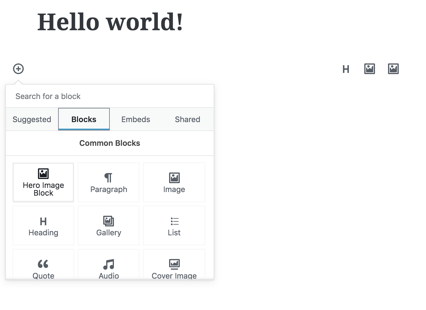
Our goal here is to create a full width, customizable hero image Gutenberg block. We aim to learn how to use the InspectorControls, ColorPalette, and MediaUpload components and use those to create a configurable block.
We’ll start off with the work from the previous article. The completed repo for the last article is located here in the article3/styles branch. You can pull that down to pick up right where we are now. I have also pushed a finished hero block branch here in case you want to see it in all its glory- article4/hero-block.
Editing some of the details about our Gutenberg block first…
Let’s start by editing some of the meta information about our block. This isn’t strictly necessary, but I’d like the title of the block to now be “Image Hero Block” so I know what it is. I’m also changing the icon because I want it to look more like an image.
...

registerBlockType('firstgutyblocks/hero-image', {
    title: "Hero Image Block",
    icon: 'format-image',
    category: 'common',

...
Now keep in mind that since I’ve updated the string to ‘firstgutyblocks/hero-image’ I need to make sure that the php functions for our plugins are also updated. They will be paying attention to that namespace/blockname that we have here. So I’ve updated my firstgutyblocks.php to this:
function firstgutyblocks_hero_image_editor_assets() {
    wp_enqueue_script(
        'firstgutyblocks/hero-image',
        plugins_url( 'build/index.build.js', __FILE__ ),
        array( 'wp-blocks', 'wp-element' )
    );
    wp_enqueue_style(
		'firstgutyblocks/hero-image-editor-style',
        plugins_url( 'src/editor.css', __FILE__ ),
        array( 'wp-edit-blocks' )
	);
};

add_action( 'enqueue_block_editor_assets', 'firstgutyblocks_hero_image_editor_assets');

function firstgutyblocks_hero_image_assets() {
    wp_enqueue_style(
		'firstgutyblocks/hero-image',
        plugins_url( 'src/view.css', __FILE__ ),
        array( 'wp-blocks' )
	);
}
add_action( 'enqueue_block_assets', 'firstgutyblocks_hero_image_assets');
Now, if you have ‘npm run watch’ running in the background, you should be able to load up the editor and see a newly-named block with that image icon in the block options list.
Now let’s make markup for our hero image block
We are going to make a block in which the user can upload an image as a background. We’ll also let them select colors for text and for the transparent overlay. We’ll also let them select a padding height to determine the hero height.
First, let’s clear out our editor.css and view.css files so they are empty.
Second, we’re going to update the block by doing the following in the edit method:
edit(props) {

    const {
        setAttributes,
        attributes,
        className
    } = props;

    function onTextChange(changes) {
        setAttributes({
            textString: changes
        });
    }

    return (
        <div className={className}>
            {/* Adding an overlay element */}
            <div className="overlay"></div>
            <RichText
                tagName="h2"
                className="content" // adding a class we can target
                value={attributes.textString}
                onChange={onTextChange}
                placeholder="Enter your text here!"
                />
        </div>
    );
},

save(props) {

    const { attributes, className } = props;

    return (
        <div className={className}>
            <div className="overlay"></div>
            {/* the class also needs to be added to the h2 for RichText */}
            <h2 class="content">{attributes.textString}</h2>
        </div>
    );
}
Note: Gutenberg now gives us <RichText.Content /> to use in the save method that handles RichText stuff for us. If you are using this new component instead, this is what it would look like:
save(props) {

    const { attributes, className } = props;

    return (
        <div className={className}>
            <div className="overlay"></div>
            {/* the class also needs to be added to the h2 for RichText */}
            <RichText.Content
                tagName="h2"
                class="content"
                value={attributes.textString}
            />
        </div>
    );
}
We already had an editable rich text field. Now we have a div that will act as our transparent overlay, and we’ve added classes to target with our css. Also, remember to make these changes in your save method!
If you save and refresh your editor you can see that our markup is in place. I went to the preview just to check the markup is the way I want it.
Styling the hero image block
Let’s add a background image to our ‘wp-block-firstgutyblocks-hero-image’ div. You have choices here- you can do styles through css, or you can place styles inline in the jsx. There are many, many fights raging over whether we should ever place styles inline. There are some really cool projects that allow you to basically keep all styles in our javascript. I basically ask myself “Is this a style that the user will want to edit themselves? Or is it static?” If it is user-changeable then I go for inline.
Hence, we will make our background image inline. To make sure it’s working, I’m going to place an inline style. Here is the code for my edit method:
return (
    <div
        className={className}
        style={{
            backgroundImage: `url('http://placehold.it/1440x700')`,
            backgroundSize: 'cover',
            backgroundPosition: 'center'
        }}>
        <div className="overlay"></div> {/* Adding an overlay element */}
        <RichText
            tagName="h2"
            className="content" // adding a class we can target
            value={attributes.textString}
            onChange={onTextChange}
            placeholder="Enter your text here!"
            />
    </div>
);
!!!Make sure you do this in your save method container div as well!!! I would load the block in the editor to make sure that the background image is showing up in both the editing block and the saved block.
If you aren’t familiar with how those inline styles are happening, here’s a pretty good overview. Basically, you create an object that looks a bit like markup, but some of the property names have to be camel-cased. We will be using this a lot in our blocks because many things the user wants control over are styles.
But the point here is that we now have a place that javascript determines the background image.
Let’s do a few more styles to make things look a little prettier…
/* view.css */
.wp-block-firstgutyblocks-hero-image {
padding: 4em 0;
text-align: center;
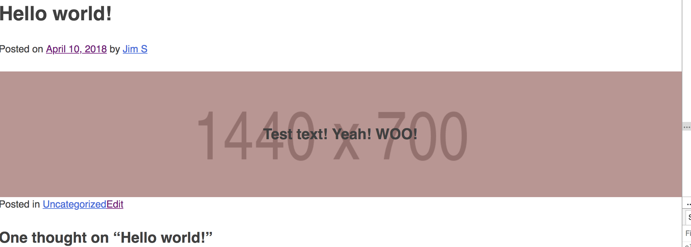
}Now we’re starting to see a hero block emerge:
Just one more thing: let’s create the styles we need to get that overlay div working.
/* view.css */
.wp-block-firstgutyblocks-hero-image {
    position: relative;
    padding: 4em 0;
    text-align: center;
}

.wp-block-firstgutyblocks-hero-image .overlay {
    position: absolute;
    top: 0;
    left: 0;
    width: 100%;
    height: 100%;
    background: rgba(150,0,0,.3);
}

.wp-block-firstgutyblocks-hero-image .content {
    position: relative;
    z-index: 1;
}
So we made the container div the position relative element for our block. We then position the overlay absolutely on the parent and make sure it covers the entire parent. This will give that overlay look- and for now we’re adding a random rgba color to show it’s working.
We also need to position relative the content string so that we can z-index it and lift it above the overlay.
So far so good!
Adding a settings panel for our block using InspectorControls
Alright, so now we’re going to let the user choose two things: the overlay color and the text color. First, let us import a block called InspectorControls. We’re going to add this as part of our edit method only. The idea is that when the block is selected, these options will show on the right side in the block settings. So let’s add the following…
const {
registerBlockType,
} = wp.blocks;
const {
RichText,
InspectorControls // New component!
} = wp.editor;
...
edit(props) {
const {
setAttributes,
attributes,
className,
focus // this is "true" when the user clicks on the block
} = props;
...
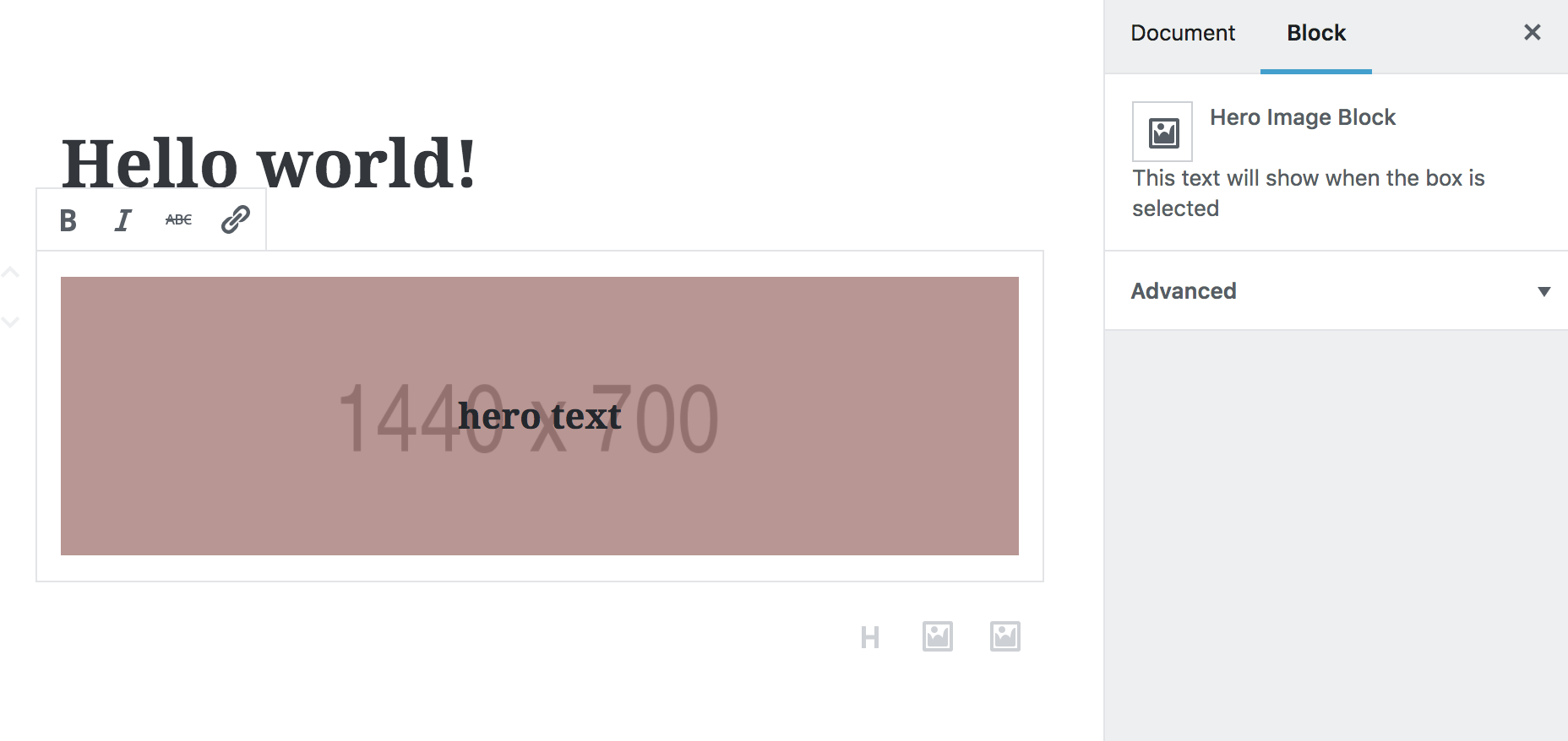
return ([
<InspectorControls>
This text will show when the box is selected
</InspectorControls>,
<div
className={className}
style={{
backgroundImage: `url('http://placehold.it/1440x700')`,
backgroundSize: 'cover',
backgroundPosition: 'center'
}}>
<div className="overlay"></div> {/* Adding an overlay element */}
<RichText
tagName="h2"
className="content" // adding a class we can target
value={attributes.textString}
onChange={onTextChange}
placeholder="Enter your text here!"
/>
</div>
]);There’s a lot going on in the return part of the code above.
- React can render an array of things. It’s easiest to return an array that has the InspectorControls separate from the actual block
- Anything inside of the InspectorControls elements will show in the sidebar in the editor.
If you refresh the block in the editor and click on the block, in the sidebar you should see your text.
Adding actual settings to the settings panel
Whew… this is getting long.
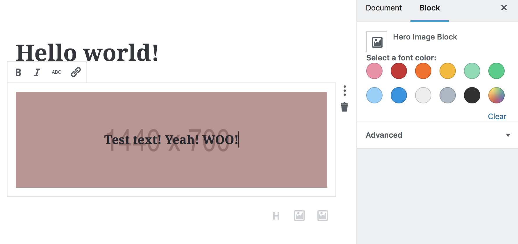
Anyway- we have our settings panel set up. Let’s import another pre-made color tool so we don’t have to work too much. Let’s import ColorPalette and use it just to show what it is.
const {
registerBlockType,
} = wp.blocks;
const {
RichText,
InspectorControls,
ColorPalette
} = wp.editor;
...
<InspectorControls>
<div>
<strong>Select a font color:</strong>
<ColorPalette />
</div>
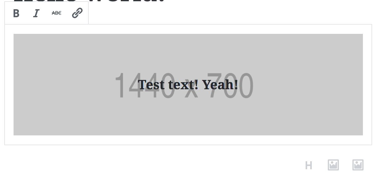
</InspectorControls>,We should see when we reload the editor and click on the block:
So no we actually need to wire this color palette to the block and make it change the font color. We will first: make a fontColor attribute, second: hook up an onChange function to the colorPalette to make it change the color, and third: create an inline style for the text that is based on the fontColor attribute.
attributes: {
    textString: {
        type: 'array',
        source: 'children',
        selector: 'h2',
    },
    fontColor: { // NEW attribute!
        type: 'string',
        default: 'black'
    }
},

...

// in the edit method, we are peeling off this attribute from props
const {
    setAttributes,
    attributes,
    className,
    focus
} = props;
const { fontColor } = props.attributes; {/* new! */}

...

//create a handler that will set the color when you click on the ColorPalette
function onTextColorChange(changes) {
    setAttributes({
        fontColor: changes
    })
}

...

return ([
    <InspectorControls>
        <div>
            <strong>Select a font color:</strong>
            <ColorPalette
                value={fontColor} {/* new! */}
                onChange={onTextColorChange} {/* new! */}
                />
        </div>
    </InspectorControls>,
    <div
        className={className}
        style={{
            backgroundImage: `url('http://placehold.it/1440x700')`,
            backgroundSize: 'cover',
            backgroundPosition: 'center'
        }}>
        <div className="overlay"></div>
        <RichText
            tagName="h2"
            className="content"
            value={attributes.textString}
            onChange={onTextChange}
            placeholder="Enter your text here!"
            style={{color: fontColor}}  {/* new! */}
            />
    </div>
]);

...

//Make sure to update the save method text styles:
save(props) {

    const { attributes, className } = props;
    const { fontColor } = props.attributes;

    return (
        <div
            className={className}
            style={{
                backgroundImage: `url('http://placehold.it/1440x700')`,
                backgroundSize: 'cover',
                backgroundPosition: 'center'
            }}>
            <div className="overlay"></div>
            <h2 class="content" style={{ color:fontColor }}>{attributes.textString}</h2>
        </div>
    );
}
To be continued…
This is getting too long to keep to one post. I will be writing a part 2 where we allow editors to pick not only the text color, but also the gradient color. We’ll also go over how to implement a MediaUpload and display custom images.
Here’s your homework: See if you can implement a second ColorPalette that changes the transparent overlay. (You will need to create another attribute.) This will be a good test to see if you have absorbed all that went into the hero block so far.
Edit: Part 2 is now up
Although the block works as expected, at this stage I’ve got a console warning in the editor:
Warning: Each child in an array or iterator should have a unique “key” prop. See https://fb.me/react-warning-keys for more information. react-dom.b69cca96.js:530
Is this something to be worried about?
Short answer: probably not.
Long answer: I wouldn’t be too worried for a couple reasons…
1) React primarily uses keys to keep track of the things that it renders. You ordinarily worry about using keys when you have a bunch (think hundreds plus) of sibling elements. And when you use keys, you are trying to make re-rendering efficient. In WordPress, this is something that would only happen while you’re editing a block, and most blocks have so few components that you would never see performance issues.
2) I’ve seen this issue pop up in the console and disappear. I’ve also seen friends who have had the issue, started fresh with a new WordPress instance, and it disappeared, or it disappeared between updates. The bottom line here is I think this is an issue with other 3rd party plugins and/or issue with the editor. Gutenberg is constantly changing and updating.
If you’re interested in the performance issues keys solve for react app:
React docs: lists and keys
Evil Martians do a great deep dive in how React actually manages components
error “Unexpected token <" in
Sorry, I’m not sure how to help you here. I need much more context into what happened before I know where that error came from.
At this section here
return (
<div
className={className}
It doesn't like the < at the start of <div
Hm… my guess is that jsx is not working for you. Maybe double check your babel is configured and installed and webpack is using babel? You might look at the first post in this series.
Thanks for writing this tutorial!
Thanks a lot for this excellent tutorial – the clear explanations , interesting and progressive examples make it easier to grasp how Gutenberg blocks work.
Thank you for this tutorial. After doing parts 1,2 and 3, I finished part 4. In this part, I have a problem with the style of the save method:
{attributes.textString}
Ah yes, there’s been a change with RichText.
An option is to use RichText.Content. I will update this post in a minute, but you might try:
<RichText.Content

    value={attributes.textString}

    style={{..}}

/>
Thanks for sharing this tutorial. Can you also please guide me how can I create a block template? I am doing the same using this resource https://wpitech.com/create-wordpress-gutenberg-block-templates/ but it’s giving an error and I am having some programming lines in front end. This is the code
add_action( ‘init’, function() {
$args = array(
‘public’ => true,
‘label’ => ‘News’,
‘show_in_rest’ => true,
‘template_lock’ => ‘all’,
‘template’ => array(
array( ‘core/paragraph’, array(
‘placeholder’ => ‘Breaking News’,
Hey, I’m not sure I can help you very much here. But I was looking at this example, and it seemed to do a good job of describing how to use block templates:
https://www.billerickson.net/gutenberg-block-templates/